Announcing New Church Bulletin Covers — The Vintage Series

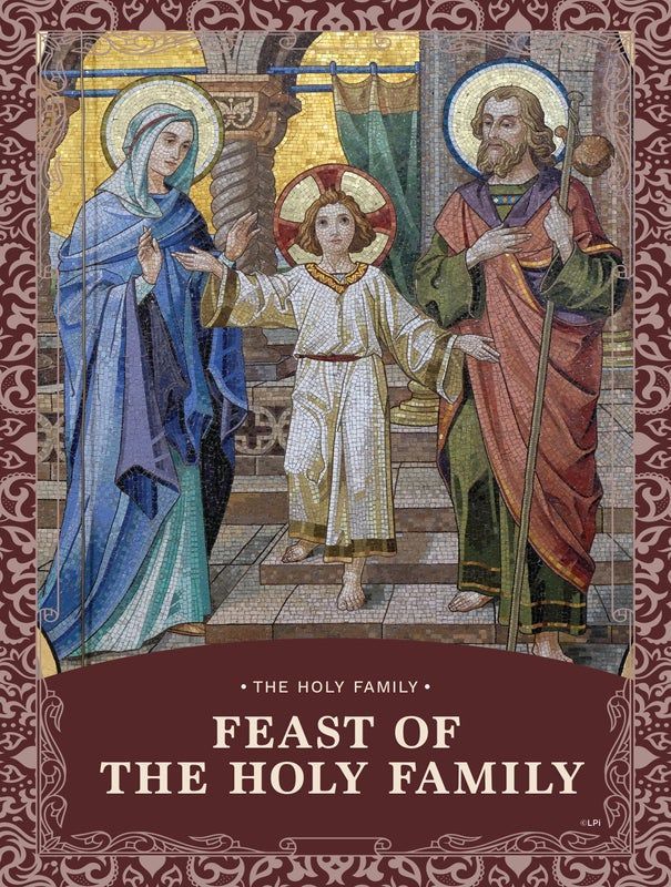
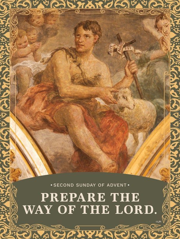
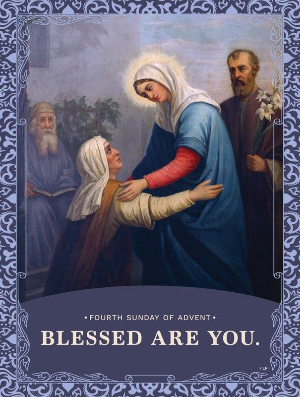
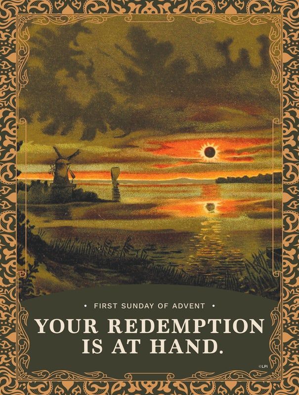
We are THRILLED to announce this new cover series, one that features vintage images for a nostalgic flair. This week, we sit down with LPi’s brand and content director, Danielle, to give our viewers a first look at this inspired series before we start releasing them into
WeCreate.
Q. Hi Danielle, can you introduce this new series to us?
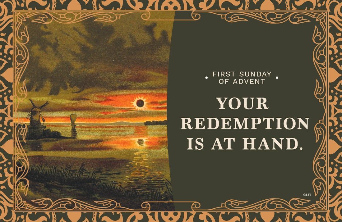
A. The Vintage Cover series is a full-cover series featuring vintage images with a nostalgic flair. Each Sunday’s design includes English and Spanish options. These are perfect for print or digital use for your parish’s bulletin but can also be used independently for other communications — including websites, social media, and more!
Q. Are these cover graphics available in different size options?
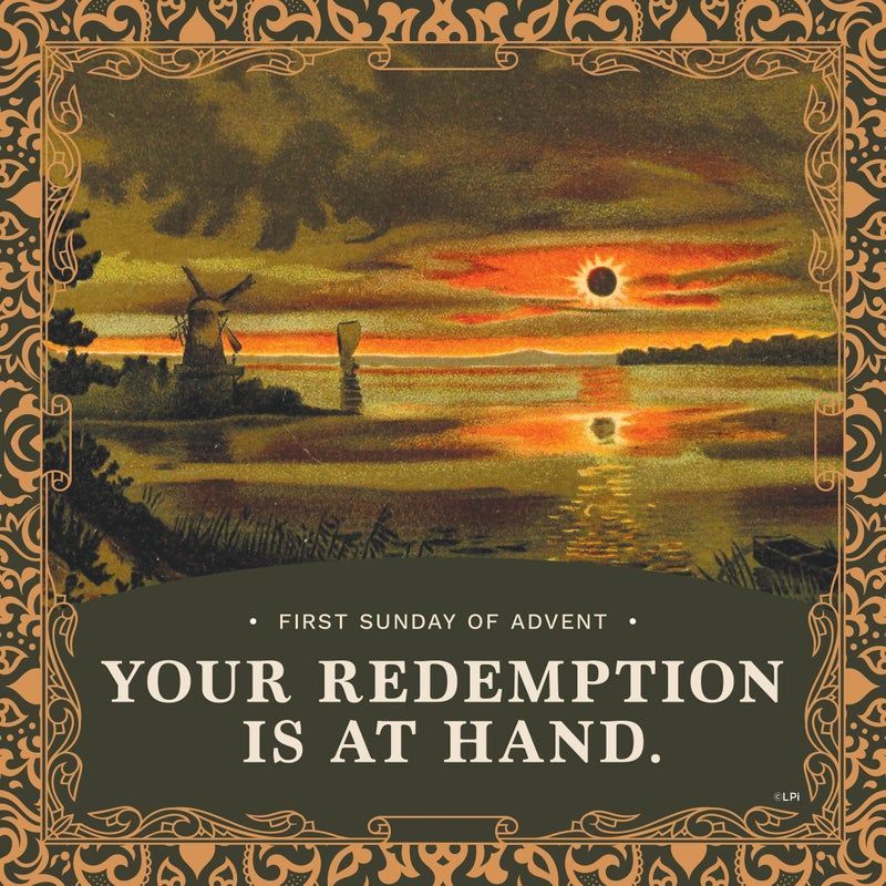
A. The covers are available in multiple sizes so that parishes can use the images with more flexibility when it comes to their bulletin layout. Users will find a full-page option, a half-page option, and a square option for each cover design.
We’ve found that including multiple sizes and orientations for every design gives parishes the ability to also use these images on their website, social media platforms, and other communications if they want.
Q. What was the concept behind this cover series and how did you approach the design?
A. Over the past couple of years, we’ve heard a lot of great feedback from the churches we partner with across the country. While every church is different, many have expressed interest in historic interpretations of religious art when polled about their preferences for bulletin covers. This cover series directly addresses their desire for a more “vintage” feel.
Q. Who are these covers for?
A. One thing that we heard in our research is that people were drawn to art that reminded them of the holy cards and other religious depictions that they remember from their childhood or their grandparents’ homes. We wanted to honor that nostalgic experience with this series. The Vintage Cover Series is for parishes whose communities might also resonate with this more “vintage” form of art.
Q. What is something you’d like our parishes to know about these covers?
A. Our designers looked to old hymnals, devotionals, prayer cards, and the like to inspire their designs. The resulting series is reminiscent of an earlier era of popular Catholic art, utilizing a large graphic surrounded by a decorative scrolling border. We are very proud of this series and are eager to introduce it to our audience!
Thank you, Danielle, for letting us know more about this new upcoming cover series.
--
To stay in the know about when LPi releases new content for vibrant parishes — like new bulletin cover series, digital images and templates, stock photography, and more — make sure to subscribe to our monthly new release emails! Don’t have access to this content but want it? Get all our relevant and reverent Catholic content inside WeCreate.
For a deeper dive into the world of the weekly bulletin, view our complete guide to Catholic parish bulletin creation. It's free!
Updated 09-24-2025

