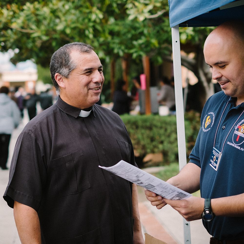
Graphics that GRAB — Designers Talk Catholic Parish Bulletin Cover Art
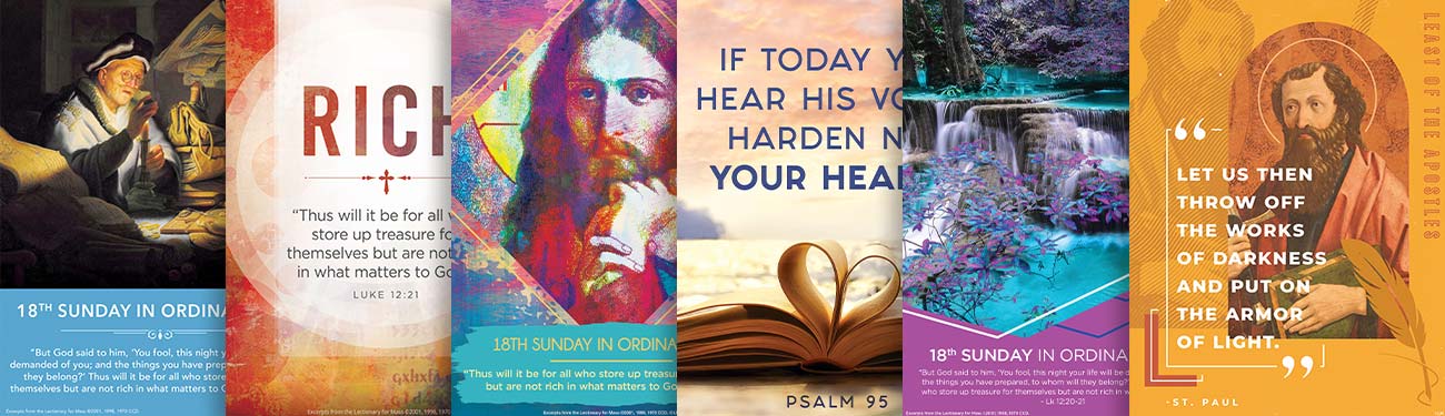
LPi’s Design Team produces Catholic art and content for a variety of parishes and preferences, providing graphics that correspond to Sunday messages and Liturgical seasons. One service that the team offers is art that can be used on bulletin covers. To appeal to a wide audience, the team provides six options for cover art each week, each with a different theme or style. Looking for new ideas for bulletin art but not sure where to start? Take a few tips from these designers! The covers they talk about are featured from left to right in order inside the headline image of this blog. Reference it to understand which cover image they are talking about.
Traditional
The Traditional series starts with the Sunday Gospel. From there, the team searches for classic art that directly represents the Gospel story — Mary and Martha, the Woman at the Well, the Feeding of the Five thousand, etc. Expect paintings from the masters of the High Renaissance — dramatically lit scenes, deep colors, striking compositions. The image will be layered with text from the Gospel message, pulling out a verse or two that captures the highlight of the story.
From the Designers…
Gabriella: Traditional art on a cover feels comfortable and familiar for your audience.Evan: When using traditional pieces people know exactly what to expect week in and week out, it’s a very straight-forward experience for your congregation.
Heidi: This design style is very clean and to-the-point while maintaining classic aspects that people love and admire.
Contemporary
Maybe you’ve done the whole painting-from-the-Renaissance route and you’re looking for something fresh and updated. Faced with this dilemma, the design team’s solution was a text-forward option they have titled “Contemporary.” This minimalist cover features subtle colors and geometric shapes playing in the background: sun rays, dots, and unique color pairings. A single word from Sunday’s scripture holds a place of prominence, with the verse containing that word in smaller type below.
From the Designers…
Gabriella: (This is her top pick of the cover series.) It is a diverse, versatile series, focused on typography, that can be used in any bulletin or social post and appeal to a wide audience range — both the younger and more established crowd. If you’re looking for something cohesive across a few months, a series like this is the way to go.Evan: In this style of art, we are using a word as the focus instead of an image. If a church is using a design with a lot of other information — Mass times, staff names, etc. — a simplified, clean graphic like a word treatment makes a lot of sense.
Heidi: This is a more simplistic choice, graphically. It is an excellent solution if there are other busy parts of your bulletin cover — masthead, logo, or other places.
Vibrant
If “Traditional” is your classic oil painting and “Contemporary” is your clean and modern word-treatment, the design style that the designers call “Vibrant” is a middle-ground between the two, recently redesigned by Heidi. This art style looks for bold and bright art depictions of the Gospel story that are a little less recognizable, think a stained-glass image of St. Paul’s conversion vs. the iconic piece by Titian. The pieces are still designed with corresponding verses of the Bible displayed below.
From the Designers…
Heidi: This is a creative piece that’s going to catch your eye, it’s artistic with painterly elements. We’ve noticed that some communities are drawn to bold, colorful pieces. When creating this piece, we keep things bright and captivating.Evan: For churches that want something a little bolder and more colorful, art that adds texture and vibrance while still maintaining traditional depictions is a good solution.
Psalm
Every Mass features a short phrase, repeated verbally by the congregation, the Psalm response. The Psalms are meaningful songs, composed thousands of years ago, but relevant and striking as ever. These short phrases have been explored by the design team and made into art pieces for a visual accompaniment to the Sunday Liturgy.
This series is Evan’s favorite, a photography-forward design overlaid with text which makes the responsorial Psalm visually appealing. Conceptually, exploring the Psalms opens a whole new world of options.
From the Designers…
Evan: The Psalm series reaches a new audience but is respectful to faith tradition. It’s successful because it has a modern media feel for a younger demographic but can still include folks who have been at the church for 50 years. Since the photography we use is always changing, the design seems fresh week-to-week.
Nature
God reveals Himself through truth, goodness, and beauty, and the designers created a nature series to lean into beauty with stunning seasonal photos of beautiful parts of creation. They pick a photo with a beautiful piece of nature and overlay with a verse from Sunday’s Gospel in a modern design with a bold color-choice.
From the Designers…
Gabriella: My favorite part of the nature series is the simplicity and cleanliness of the design. It’s image-heavy, focused on landscapes with different natural features.Heidi: It’s modern, minimal, and it focuses on the beauty of the world.
Saint
Long-term LPi followers might be familiar with a piece made after beloved Catholic saints. In this series, photographs of modern life were overlaid with a quote from a beloved saint, all in a subtle monochrome color treatment. BUT WAIT! That series will experience an update in the coming year! Beginning with the First Sunday of Advent, this series will still feature a quote from an inspiring Catholic hero.
From the Designers…
Gabriella: Our new design is a fresh, new take on what defines traditional artwork and what that can look like.Evan: The imagery is comfortable for a church audience, but in a modern format.
Heidi: A modern take on collage — stay tuned!
(A sneak peak of this new series is hidden in the collage of covers at the top of this blog post!)
For access to all of these cover series as well as thousands of pieces of art and content ready for your immediate use in your parish's communications, subscribe to WeCreate.
Need more Catholic church bulletin inspiration? Head over to LPi's weekly blog and check out the "Church Bulletins" section!
Updated 06-24-2025
Share
You might also like
LPi Blog