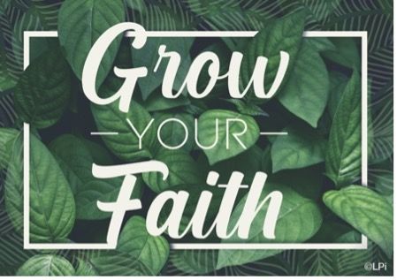
Tim — I think what made this design successful in my eyes is how clean and cohesive it feels. All the aspects, from the shade of green in the leaves, to the font, and the subtle texture of the piece all go together well and give off the same level of calm. Even though the elements blend well, the message still clearly pops from the background. I love looking back at this one and using it for inspiration for my future designs.
LPi Designers Weigh In — Our Favorite Designs of 2023
Chelsea Wilde • December 7, 2023
At LPi, we are so proud of the multimedia design team responsible for the thousands of graphics, cover designs, templates, and more that we release every year into our WeCreate library of Catholic content. These images are created for our parish partners to use in their bulletins, websites, social media posts, flyers, and any other way that they may need!
As 2023 winds down, we asked our designers to share the pieces they most enjoyed making over this past year and why. We collected their answers for your viewing pleasure — Enjoy!
Tim —
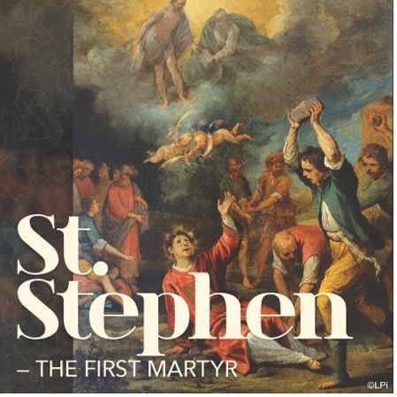
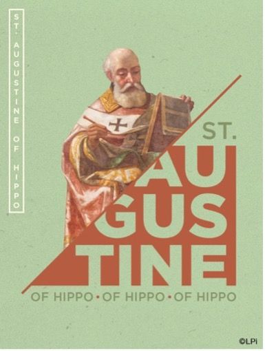
What made me happy with this piece was the outcome of its form and layout. I used traditional imagery, patterns/textures, and a more traditional-feeling font and then put them all together in an asymmetrical and modern-feeling layout. The text in the corner does not find itself lost and still allows the viewer a great look at the beautiful artwork.
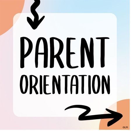
Tim —
This one was fun. Using black alongside white and vibrant pastel colors creates a very young and playful look. I paired these choices with a font style that we don’t typically use as well as some hand-drawn accents to double down on the playfulness of the design. I was super happy with how different it was and how simple.
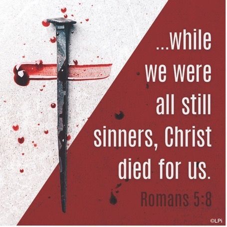
Tim —
I know for some the sight of blood can be disturbing, but this was the perfect image to pair with this message. I think the imagery is the king in this design because it makes you think more about what you are reading. The contrast and diagonal slash that I incorporated draw you to the image right away while the message and imagery engage your thought. Overall, it is very powerful.
Gaby —
These were some of the first Facebook Story designs I got assigned to create! Overall, I really enjoy the more “lighthearted” and “child-like” feel that they evoke. Social media stories should be both informative and fun, and I feel that these designs are just that!
Gaby —
This was by far one of my favorite pieces of 2023! I love collage-style design and wanted to implement that into this graphic. I also really enjoy working on Spanish artwork, mainly because of my Hispanic heritage but also because it comes with challenges that are different from the English language pieces. Spanish text is much longer typically, so I love playing around with the layout on these pieces! My goal is always to showcase the overall beauty and importance of Spanish artwork.
Editor’s note — Speaking of “collage-style design”, Gaby also designed a brand-new cover series that will be released this upcoming Advent and will continue for the entire liturgical year that also features a collage-style layout. Check out our announcement blog about it to see some of these beautiful covers.
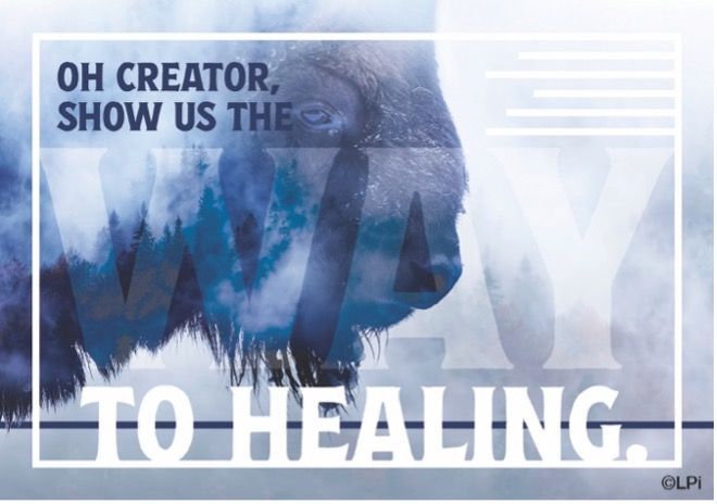
Gaby —
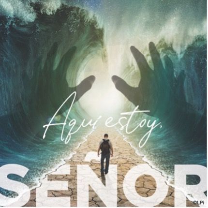
I really enjoyed working on this piece from a design standpoint, but I resonated with the content of it as well! “Oh Creator, show us the WAY to healing” is so powerful. Many times, we ask that when we feel stuck in a hard place, which can feel like a fog. For that reason, I chose this specific imagery to give the audience the feeling of “cloudiness.” I wanted to further highlight that the true Creator is the only one who can take you out of that fog!
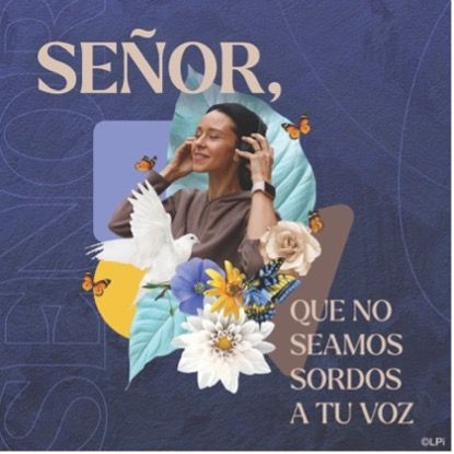
Gaby —
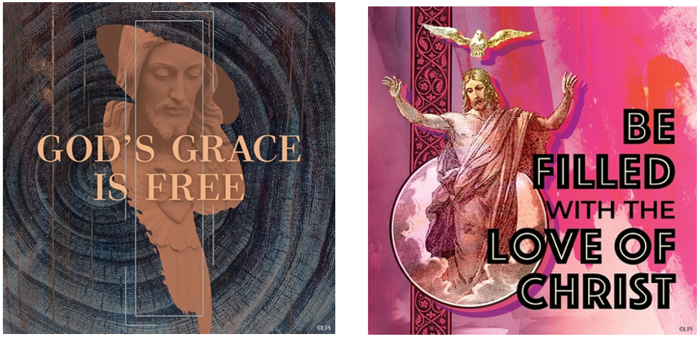
I very much enjoy when I see art that seamlessly intertwines the imagery and text together to create harmony in a piece. That was what I liked about this design, the interaction between all the subjects at play. Who says you can’t take traditional artwork and make it more modern?
Gaby —
I designed this graphic more recently and it has been one of my favorite pieces to date. Graphic design is so much more than images or text on a white background — it should make you feel something. It is the goal of any designer to give their audience that same feeling that they got when they designed their piece! This design meant a lot to me, personally, and I hope it moves its viewers in the same way that it moved me!
Heidi —
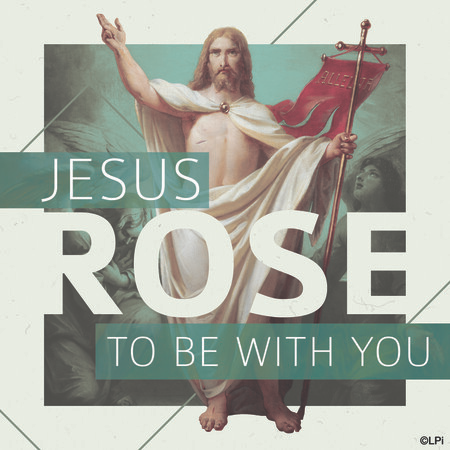
I like these two pieces for the same reason. I really enjoy picking a traditional form of art like painting, sculpture, lithograph, etc. and using it in a new and modern way. Mixing textures and non-traditional colors with traditional art can create something really interesting to look at!
Kristen —
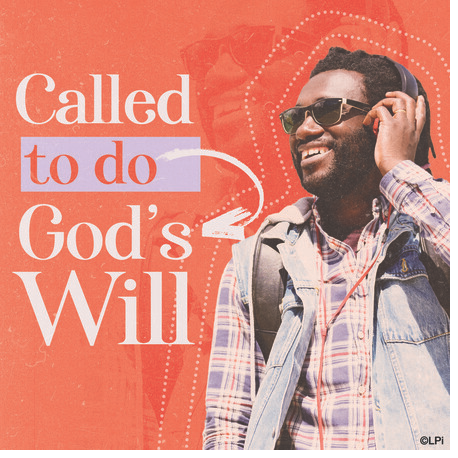
This piece was one of the favorites I worked on this year. I enjoy the contemporary aspect of the design. Not too often am I able to use this style of color palette, faded red, lavender, and vanilla cream. I also love the focus of the text in relation to the image.
Kristen —
I like using traditional oil paintings of the Gospel paired with a modern treatment to break up the design. It is a nice reflection of the meditation. The meditation art pieces are some of my favorite pieces to work on for WeCreate.
Editor’s note — Kristen also designed a whole new bulletin cover series that will be released into WeCreate this upcoming Advent called the Immerse Series. You can view some of the Immerse covers in this blog that we recently posted announcing the new series.
Share
You might also like
LPi Blog
It does sound unbelievable, the story of the Resurrection. But lots of things are unbelievable. That doesn’t mean they’re not true.
Everybody’s trying to find God. They may not admit it. They may not even know it. But the search defines them, and it defines us.
I’m Catholic. I’m proud of being Catholic. But is that wordless witness really evangelization?