Our Favorite Faith Graphics this Year!
Each year, our LPi multimedia team pours creativity and passion into the thousands of designs that fill our WeCreate library with fresh Catholic content for parishes everywhere. Whether the images are used for bulletins, social posts, parish websites, or other communications, they’re here to help bring your ideas to life.
As 2024 wraps up, we asked our talented designers to share the projects they most enjoyed creating this year. Here’s a sneak peek into what inspired them and why. We hope you enjoy their favorites as much as they enjoyed making them!

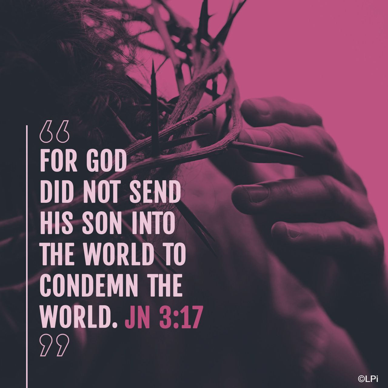
Heidi —
This piece stood out to me because of how the message mixed so well with the colors I used. The combination made it so that the image invokes hope. I also love the details on the chalice and the subtle texture and brush strokes. The result feels both timeless and vibrant — perfect for churches aiming to uplift and engage their communities.
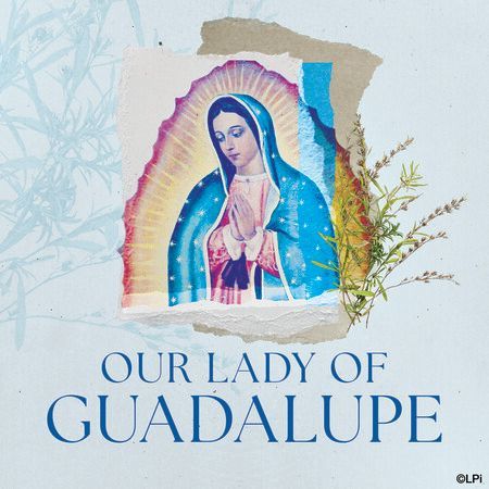
Kristen —
I appreciate this image for its softer color palette, which is perfect for representing Guadalupe. The use of textural elements and a layered appearance evokes traditional styles while offering a modern twist through the vibrant colors associated with the image of Our Lady of Guadalupe.


Kristen —
As a compilation of images, I truly admire this final design for a social media story. It radiates vibrancy and energy, focusing on the priests who serve their communities — an excellent way to honor Priesthood Sunday.
Kristen —
I appreciate the traditional aspect of this design, which features classical Renaissance artwork of Mary. Moreover, I like how the Spanish elements of this celebration are prominently highlighted, while the English text is included intentionally as a secondary focus within the design.

Tim —
This design was outside the box of what I typically do. The rich, earthy tones of brown and yellow evoke a warm and welcoming feel. The mix of symbolic images — a chalice and bread, a classic depiction of Jesus, and an image of joyful praise — invites viewers to connect personally with the message. The bright yellow arrows guide the eye and create a sense of movement, making it an engaging piece for bulletins or social media posts that need to stand out.

Tim —
This defines simplicity, evoking a sense of peace. The combination of elements gives it a vintage feel that is both comforting and timeless. It’s a reminder that simple graphics, when thoughtfully composed, can have a profound impact on the viewer.
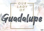
Tim —
This one really feels gentle and beautiful. The soft colors — pinks, blues, and greens — along with the simple floral accents, make it feel peaceful and full of love, just like Our Lady. The bold, textured font of "Guadalupe" adds a contemporary touch, making it both classic and fresh.
Kyle —
Using a monochromatic color palette can be challenging at times, but I really enjoy the simplicity of this piece. The off-white background creates great contrast and draws your attention to the familiar variety of oranges we also see during the fall season.


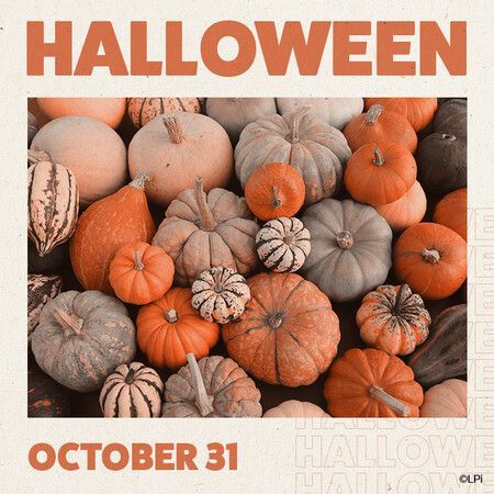
Kyle —
Using a monochromatic color palette can be challenging at times, but I really enjoy the simplicity of this piece. The off-white background creates great contrast and draws your attention to the familiar variety of oranges we also see during the fall season.
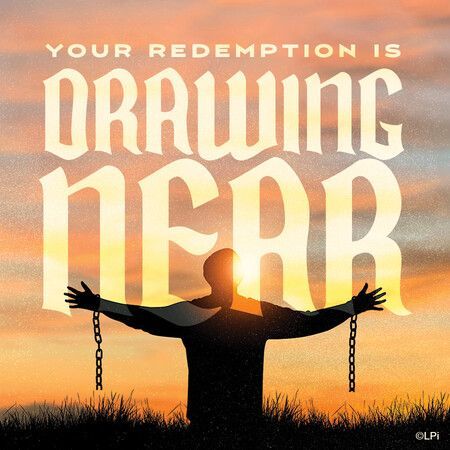
Kyle —
Gospel Meditations are some of my favorite WeCreate projects to work on. They typically feature powerful language relating to the Gospel which offers the opportunity to pair it with imagery just as powerful. This design, for example, showcases someone in darkness looking to the light with open arms, welcoming their redemption that is soon to come.
Make sure you are subscribed to our WeCreate library if you want access to all of the graphics featured here, along with thousands of other pieces that we have available. Your parish communications will never be the same!
If you’re an LPi bulletin customer, you are already subscribed and have access to WeCreate! Remember, our customer support team is always ready to assist you if you need help accessing these tools. You can contact them here.
Share
You might also like
LPi Blog