Take Your Church Flyer Game Higher - Catholic Tips for Making Better Flyers

Have you ever heard the phrase “work smarter, not harder”? When it comes to church events, having a work smarter goal can save you some major headaches over the course of your event planning and execution. We all know that having professional looking flyers and advertisements for your event or program is essential to people attending or signing up, but let’s be realistic — how many graphic designers do you actually have on your Catholic church's staff to make them? If your answer is NONE then, this blog is for you! We’ll outline a few best practices, give you some examples (scroll to the bottom if you want to skip to these), and share about a template tool that can save you loads and loads of time!
Flyer Tip 1: Don't Use so Many Words
The single worst thing anyone can do when trying to design an effective flyer is to put way too much information on it. Remember, a flyer is not a brochure. Flyers are not meant to share every single little piece of information about a program or an event. All of your event’s little details can be outlined in a program, webpage, or brochure that your flyer ultimately directs people to. The purpose of a flyer is to grab a person’s attention, create interest, and invite a call to action. That call to action might be to register, visit a website to learn more information about something, pick up a brochure/program, or to simply show up! Before creating your flyer, ask yourself what the most basic important information is that needs to be communicated.
The specifics that are most likely needed on your flyer include your event’s:
- Location
- Date
- Time
- Cost
- What’s Included in the price
- Who the event is for/Who is invited
- Contact Information
- Cutoff date for registration or RSVPs
- QR code to a web page with more info or instructions on how to learn more
Information that you may be tempted to include but should probably be put in a web page or brochure instead includes:
- Full event schedules
- Menus
- Speaker/Presenter Bios
- Arrival or location instructions
- Letter-like event descriptions. For example, something like —
“Join us for ou r winter dance fundraiser where everyone can have a lot of fun and raise money for the Covington Food Bank” should, instead, simply say — “Winter Dance” with “A benefit for the Covington Food Bank” on the line below.
Flyer Tip 2: Know the Psychology Behind Good Design
Did you know that our brains are wired to be attracted to some types of designs and repelled by others? Some tips that will attract people to your flyer design are:
- Use a larger font!
Using a font that is too small can cause people to actually look away from your flyer due to the image being way too busy. Our eyes seek out big, bold images and when words on a flyer are too small and too many, people often won’t even try to read them. - Give things space!
Don’t try to squeeze too much information in your flyer by smushing everything together on the page. Busy images with little space to let the eye rest can actually cause people anxiety and create an environment where they actively look away from the flyer to avoid the mess of images and words instead of being drawn into it. - Use intentional colors!
Using too many colors or colors that don’t go well together can create the same type of anxiety for the viewer as using too many objects or words can. Did you know that it used to be a common practice in fast food restaurants to color the walls with multicolored wallpaper and mix all of the primary colors together inside their restaurants because the psychological effect of the constant bombardment of many different colors was that people would feel uncomfortable and would eat and then leave the restaurant more quickly? This way the fast-food chain keeps things moving fast! This is the opposite of what you want to be doing with your flyers, so, choose 2 or 3 complimentary colors and stick with those! Don’t go overboard! - Remember that hierarchy matters!
The most important elements should be seen first so they will be the largest, and boldest. It wouldn’t make sense to have the time and cost be the largest part of a flyer — instead, the name of the event and any information that might hook the viewer should be your focal point.
Flyer Tip 3: Use a Catholic Content Library
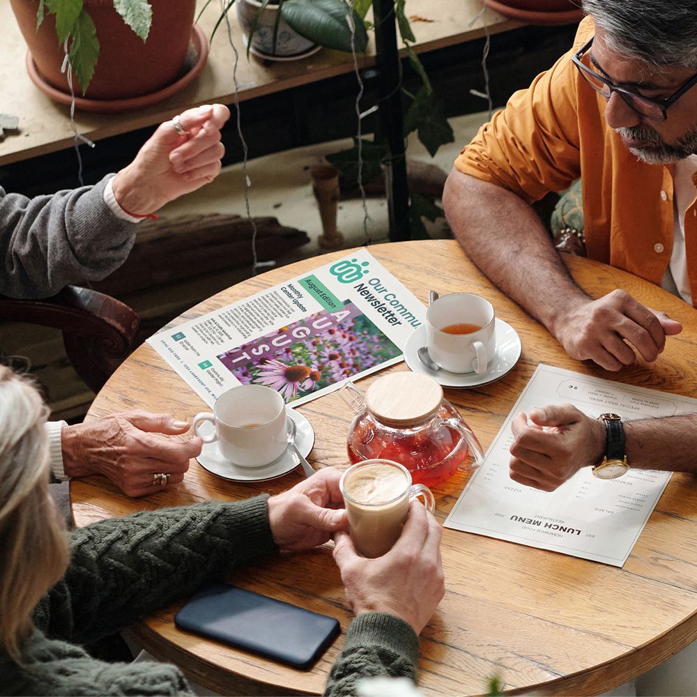
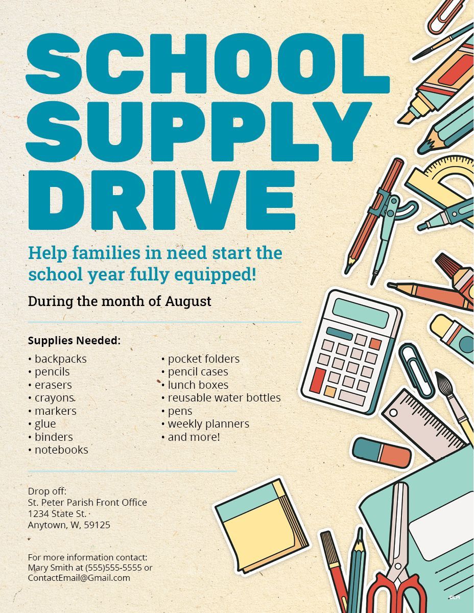
Let’s give you a major leap forward into the “work smarter” arena and introduce you to the LPi ready-made flyer template tool. WeCreate, our ever-expanding collection of thousands of graphics, stock photos, and design templates , provides subscribers professionally designed, downloadable content for your church’s print and digital projects! In WeCreate we have a collection of flyer templates made by our design team that you can very simply customize and use for your own events! Here's a sneak peek:
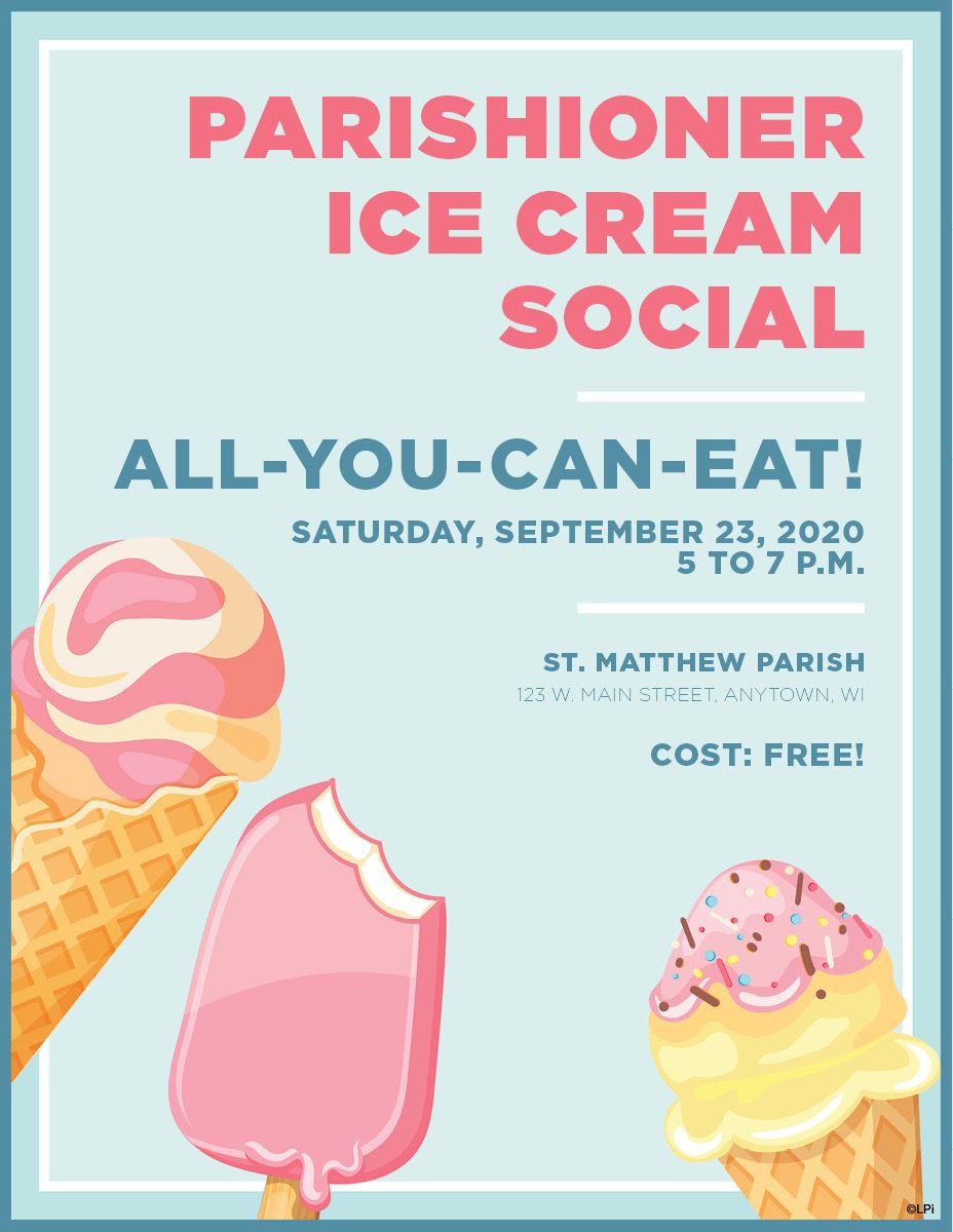
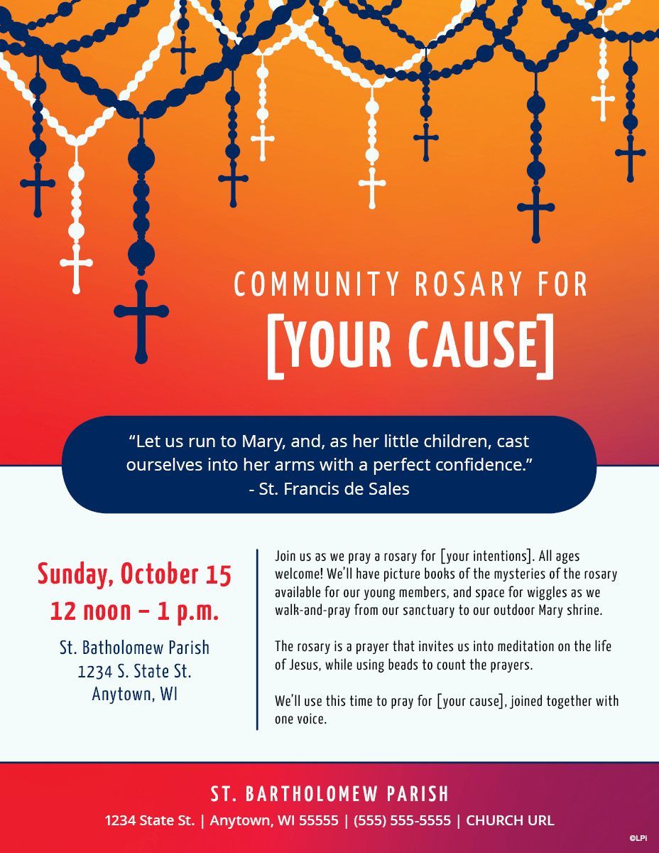
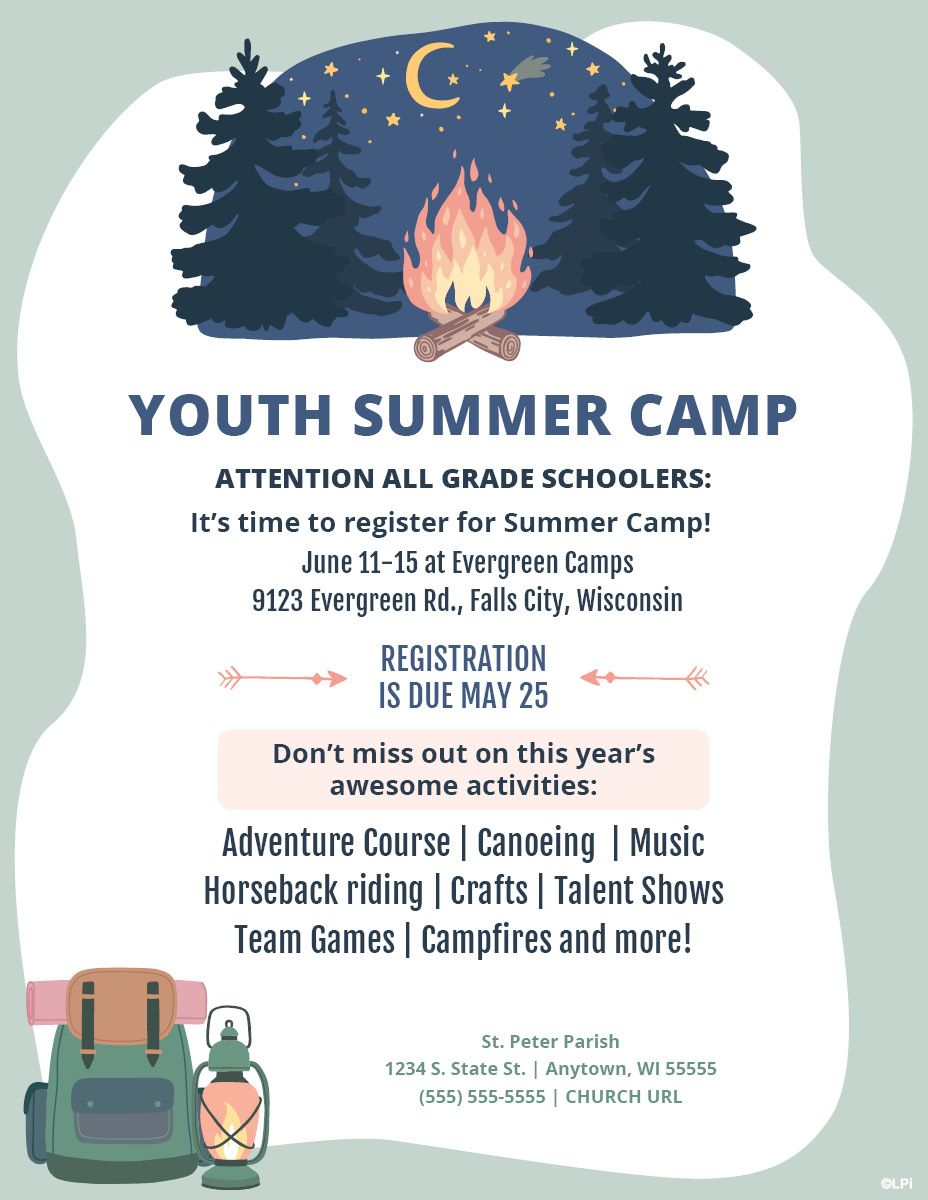
Like what you see? Find more inside
WeCreate or take a deeper dive into
how to use WeCreate to elevate parish communications of all kinds!
Updated on 10-25-2025
Share
You might also like
LPi Blog