The Best Church Bulletin Designs of 2023 Revealed
What makes a successful church bulletin? After designing bulletins for parishes across the nation this past year, our designers weigh in on what bulletin designs stood out to them and why. Following the three examples of superstar bulletins we showcase below, we outline what design elements are best to include in your parish’s bulletin layout to effectively (and beautifully) communicate your church’s mission and the message of Jesus. Let’s get started!
Bulletin Superstar 1:
Bulletin designed for the Epiphany Cathedral Catholic Church in Venice, Florida.

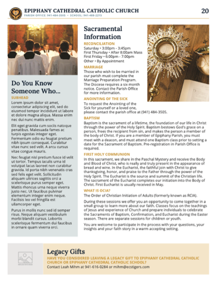
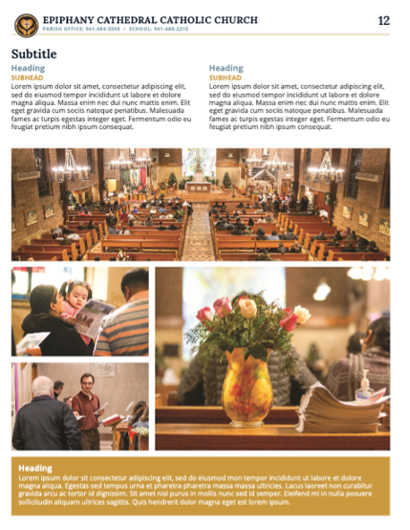
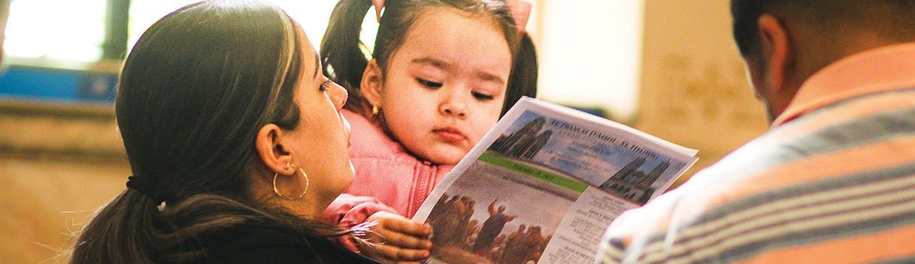
Notes from the designer: This customer had a couple of pages that featured an image gallery, which is not something we see often in church bulletins. It’s easy for a gallery inserted into a bulletin design to end up looking very busy with a lot of photos overlapping, so creating a clean layout was important. As it turns out, an image gallery inside your parish bulletin is a great way for visitors to get a sense of your church community and it can also make parishioners feel engaged and eager to participate.
Bulletin Superstar 2:
Bulletin designed for St. Mary’s Catholic Church in Huntingburg, Indiana.
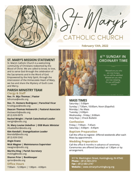


Notes from the designer: In general, I think what makes any bulletin design successful is cleanliness and organization. It’s important to utilize “white space,” which can be a drastic change for some parishes at first, but it allows for the pages to breathe and for the viewers to be able to follow the information better.
Another component to having a successful publication is the customers’ overall branding and their color scheme. In this bulletin, St. Mary’s already had a beautiful logo and brand colors chosen upfront, which made the design portion much easier and enjoyable! To see their logo come to life through their bulletin makes for a much greater impact than if the parish didn’t have those elements established.
Bulletin Superstar 3:
Bulletin designed for St. Thomas Aquinas Catholic Church in Wichita, Kansas.


Notes from the designer: I almost always gravitate towards a more modern esthetic for bulletin design projects. I just love the endless possibilities that modern styles have. I also love seeing how I can push a design idea that was maybe more traditional at the start and give it a modern twist while remaining true to the spirit of the parish the bulletin is being designed for. You would be surprised at how many of our customers who lean more toward being a traditional parish end up loving our modern artwork and design. They never know what they might like until they see it! This bulletin has a great, clean, modern style that allows the parish to include the information they need while also expressing the traditional charisms of their parish.
What makes a bulletin design successful?
Thoughtful design for your parish bulletin not only conveys information more effectively but also contributes to fostering a welcoming atmosphere that can make visitors and parishioners feel more connected. Outstanding church bulletin designs that strengthen the sense of community and spirituality within a parish often include the following design elements:
On the Cover
- The parish’s brand identity (church name and imagery) is clear and easy to read. If your parish doesn’t have a concise brand identity yet,
our team can help!
- There is a large image with bright colors to grab attention and pull the audience in. Churches can find a large selection of cover images and graphics that will satisfy this important design element inside of WeCreate.
- The most important information (Date, Liturgical Sunday, Mass Schedule, etc.) is organized and concise.
Interior Pages
- Each page should continue to use your parish’s brand identity (logo, colors, fonts) for consistency and professionalism.
- There is a good balance of graphics, photography, and text to keep the reader engaged. Too much text can be overwhelming to the eye.
- Be sure to use negative space to make it easier to digest the information on each page.
For even more bulletin design ideas, dive into our recent article “This, Not That — Simple Swaps for Better Bulletins” or check out these before and after images of bulletins we’ve designed fresh new looks for. If your parish is ready for a new bulletin design, get into touch with us so that we can help make your bulletin as beautiful and vibrant as your parish community already is!
Share
You might also like
LPi Blog