Tips for Printing Your Catholic Parish Bulletin in Color: CMYK vs. RGB
Even if you aren't printing your church bulletin with LPi, you still have to prepare your content for the printer every single week! Here are some helpful things to keep in mind.
CMYK — Stands for “Cyan,” “Magenta,” “Yellow,” and “Black,” — the four ink plates often used in printing.
RGB — Stands for “Red,” “Green,” and “Blue” — primary colors used in digital communications like television or websites.
Notably: computer screens display in RGB and involve an internal light illuminating the screen for ease of reading. Printed projects will use CMYK, not RGB, and don’t have a light illuminating them from behind as a computer screen does, causing many to comment that printed pieces appear “darker” than their digital counterparts. Keep that in mind when setting up a print project — your printed piece may appear slightly darker than your digital piece. Adjust accordingly for best results.
When printing CMYK, each ink color is assigned a percentage on a 100-point scale. For example, for a pure red, the printer selects: 0% Cyan, 99% Magenta, 100% Yellow, and 0% Black.
Not sure of your percentages? Here are some tips for ways to achieve success in coloration!
CMYK BLACK
Black and 85% Black make great accent secondary colors to a bright feature color, and convey a strong, modern design.
Black is one of the CMYK colors, so the density of the hue will depend on the percentage of black ink used. A blend of all the CMYK colors can be used to result in a “rich” black, or more saturated color. Be careful when adding black to other colors — an attempt to use black to darken other colors can often make them muddy.
CMYK REDS
Red is best used for a traditional, strong look, it pairs well with oranges and golds for a warmer, energetic style. Red can communicate warmth and passion, but it also can be overwhelming if used too heavily. Reds are a finicky bunch when it comes to printing — sometimes appearing orange or rusty upon print. If you find that your red is too pink, your magenta level is too high. If you see too much orange, yellow is too high.
CMYK ORANGES AND BROWNS
Orange can be great way to show a cheerful, enthusiastic, youthful style when paired with bright light blues and teals. To achieve a bright orange, use two parts yellow, one part magenta. Orange can command attention without being overpowering.
Brown is a neutral and earthy look that conveys reliability and warmth. Brown brings a sense of wholesomeness to designs. Our recommendation is to use different shades of brown, think “tan,” or “russet,” or “caramel.” Brown is similar to orange — a blending 2 parts yellow, one part magenta is the starting point, but the amount of cyan added begins to direct the color in a brown direction.
CMYK YELLOWS AND GREENS
Yellow is often considered positive, optimistic, and energetic. Yellow is one of the CYMK inks
— use more magenta to make it more golden.
Green appears on the “cool” spectrum of color, and it is considered a calm and peaceful color. Green is often associated with growth, rebirth, nature, stability, endurance, and abundance. It is often related to wealth, as well. Mixing cyan and yellow results in green. For vibrant greens, mix cyan and yellow equally.
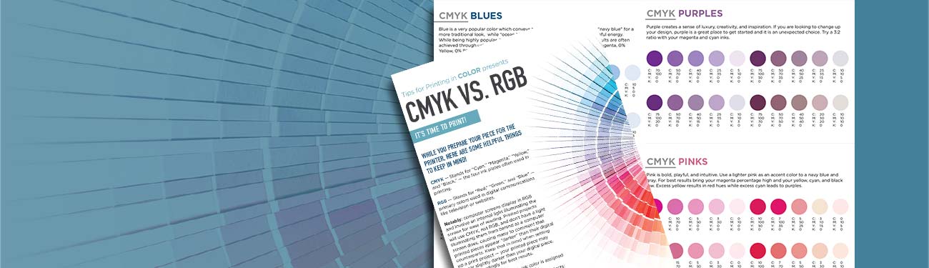
CMYK BLUES
Blue is a very popular color which conveys trust, loyalty, and peace. Use a “navy blue” for a more traditional look, while “ocean blue” introduces a more modern, peaceful energy.
While being highly popular, it is difficult to accurately produce. The best results are often achieved through using even and balanced mixtures (i.e. 100% Cyan, 50% Magenta, 0% Yellow, 0% Black).
CMYK PURPLES
Purple creates a sense of luxury, creativity, and inspiration. If you are looking to change up your design, purple is a great place to get started and it is an unexpected choice. Try a 3:2 ratio with your magenta and cyan inks.
CMYK PINKS
Pink is bold, playful, and intuitive. Use a lighter pink as an accent color to a navy blue and gray. For best results bring your magenta percentage high and your yellow, cyan, and black low. Excess yellow results in red hues while excess cyan leads to purples.
CMYK GOLDS & SILVERS
Metallics are neutral. They give a refined elegance that conveys confidence and prestige. Use these tones with a burgundy, berry red. A true metallic isn’t possible on a standard CMYK printer like the ones used at LPi — metallics require specialized equipment with either Pantone spot inks or foils.
CMYK BRIGHT COLORS
On the lookout for the most vibrant rendition of colors possible? Without the backlighting of a computer screen, a printed page will never produce hues as brilliantly as a digital display, but color mixes that will pop are usually deeply saturated with at least one of the CMYK colors at 100%.
Want a free weekly printed bulletin for your Catholic church? Learn more about LPi's ad-supported church bulletin services here!
Updated on 06-25-2025
Share
You might also like
LPi Blog