Visual Ministry — Discover the Strongest Parish Bulletin Designs of 2024!

A well-designed Catholic bulletin is more than a beautiful piece — it’s a strategic tool for outreach. When parishioners pick up a bulletin that is visually compelling, organized, and aligned with the church’s mission, they’re more likely to read, remember, and respond to it.
Our designers create custom parish bulletin designs for Catholic churches across the United States. We asked them to reflect on the standout designs they have created over the past year — the ones they feel did the best job of inspiring connection, engagement, and faith. Below, we highlight their choices for the best bulletin designs of 2024 along with the thoughtful design elements that help bring each of these parish’s messages to life.
The images shared in this article are from each parish’s custom bulletin design template. A complimentary bulletin design template is included when parishes sign up for our free ad-supported parish bulletin service. The examples below come from the templates delivered to each church, complete with filler content in them that each parish replaces weekly with their own content. Enjoy!
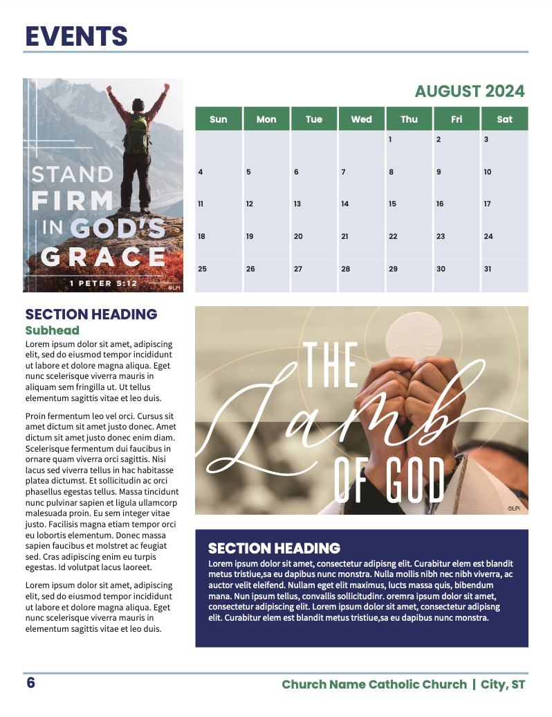
Bulletin Top Pick 1:
Holy Redeemer Church in New Bremen, Ohio.
Notes from the designer:
This bulletin design is one of my favorites for its clean, structured layout that makes editing and organizing content so much easier. The minimalist aesthetic keeps the focus on the most important sections, while subtle color accents naturally guide readers through each page. This format is ideal for bulletin editors looking for a layout that is both functional and inviting, perfect for keeping parishioners engaged and informed.
Bulletin Top Pick 2:
St. Mary’s Catholic Church in Boise, Idaho.
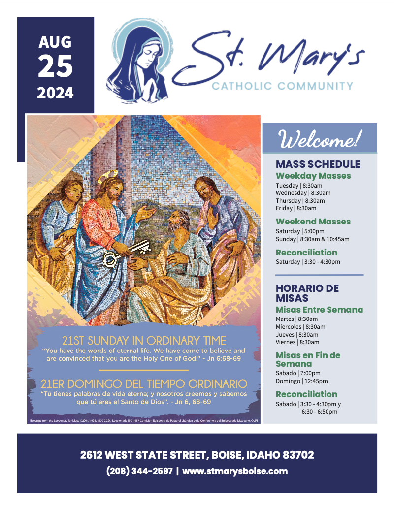
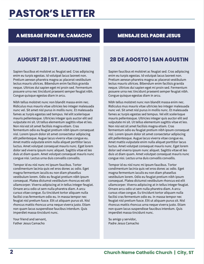
Notes from the designer:
This bulletin was designed for a bilingual parish (Spanish/English) so it needed to include a lot more text than a single-language bulletin normally would. I really enjoy this design because I feel that I was able to incorporate both English and Spanish into a really clean and easy-to read layout. Both languages are present and legible. This allows the church to communicate their information effectively to their entire community, drawing each member into the whole regardless of what language they are native to!
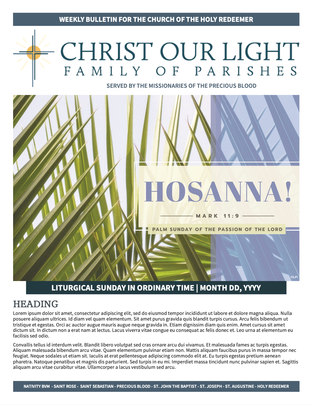
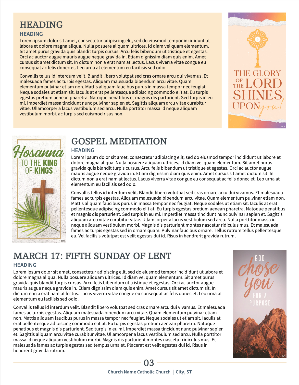
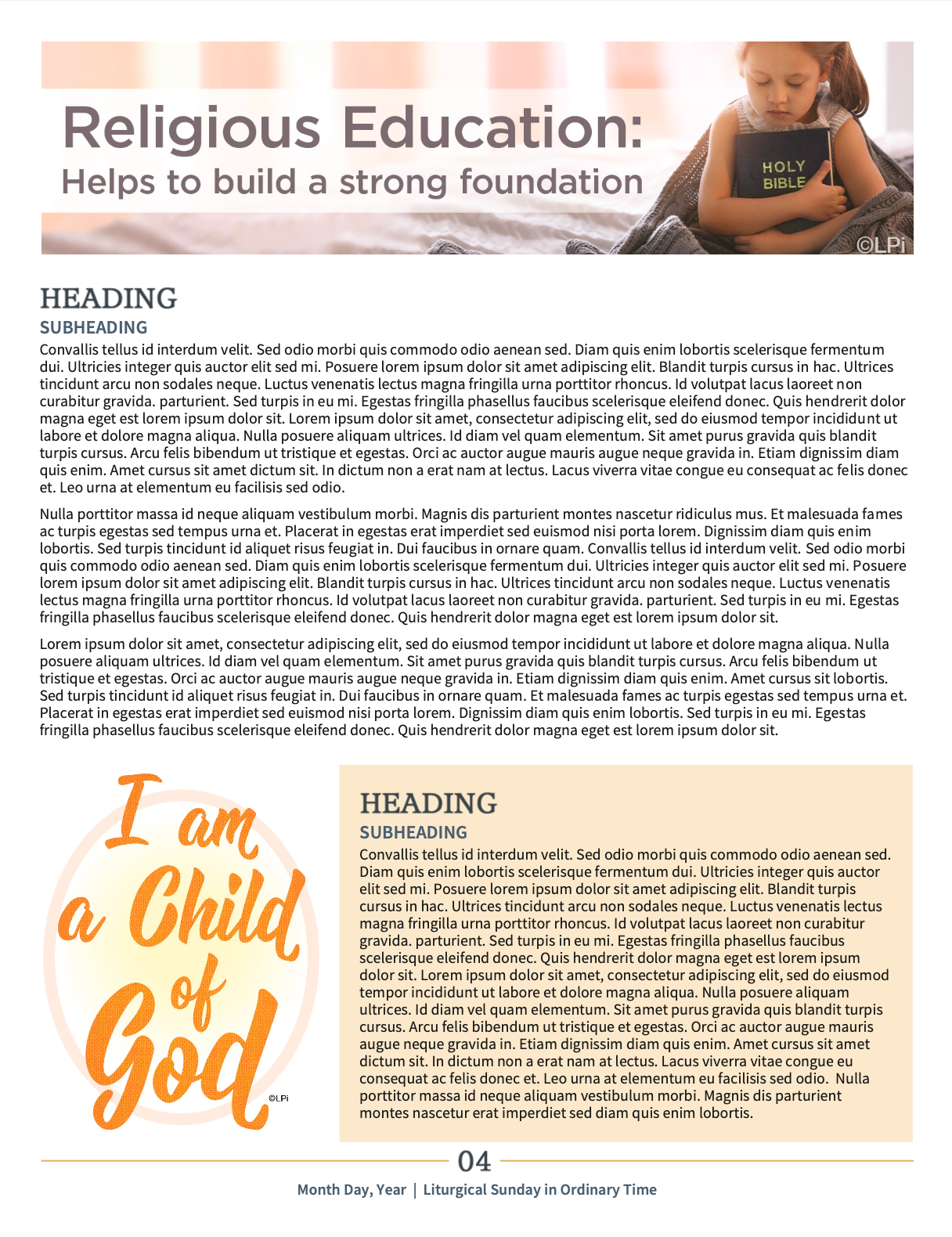
Bulletin Top Pick 3:
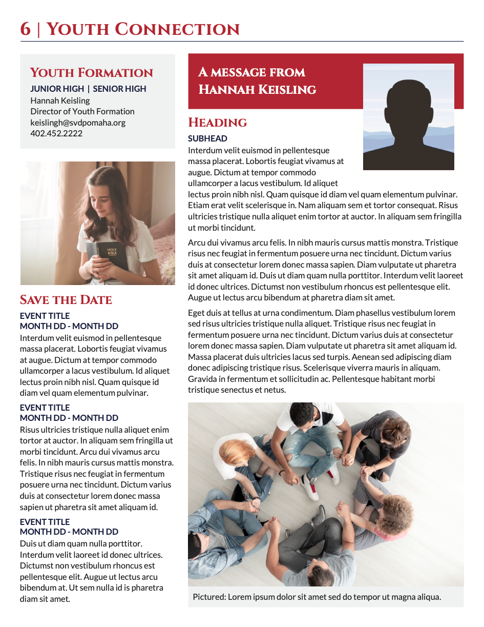
St. Vincent de Paul in Omaha, Nebraska.
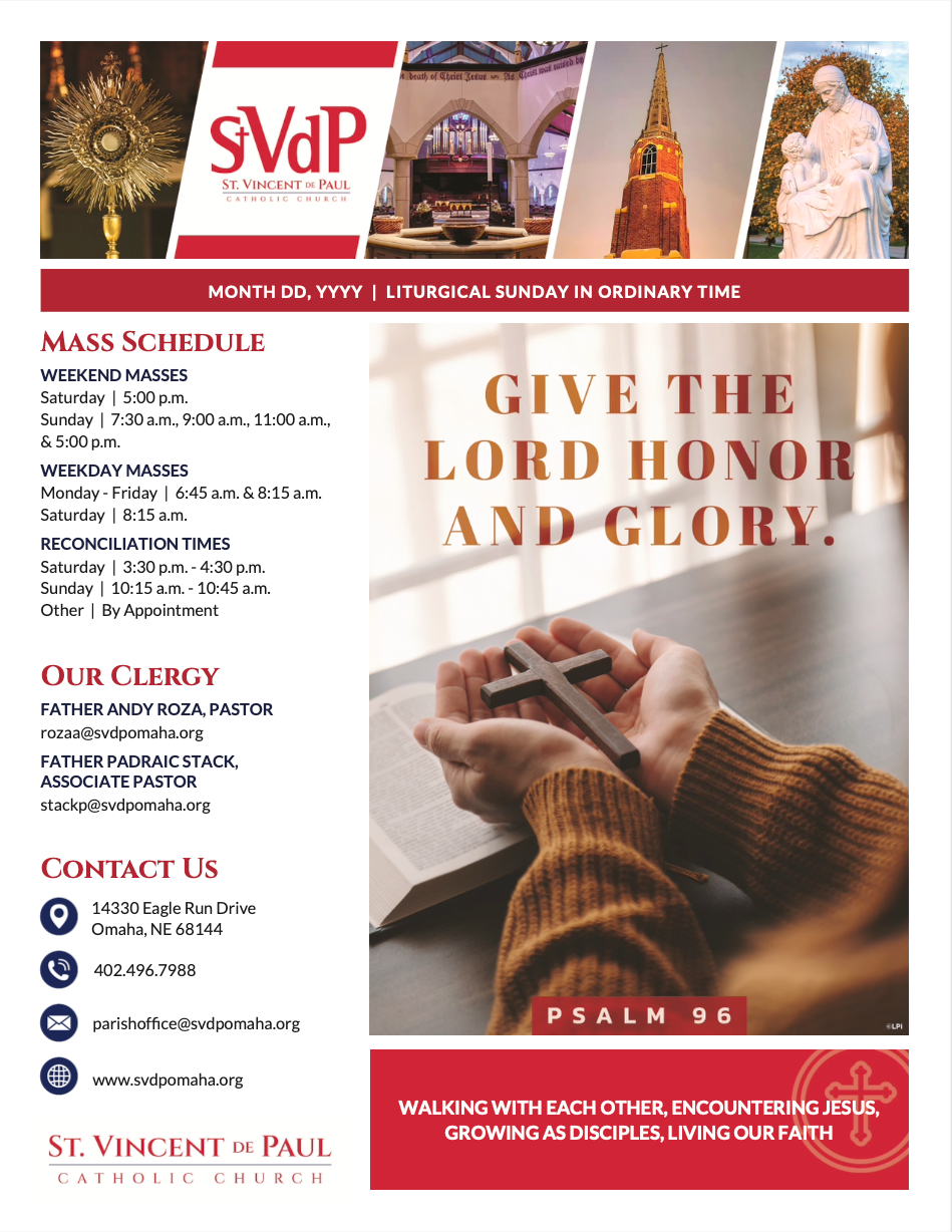
Notes from the designer:
This bulletin’s cover design is a good example of how to successfully mix content and imagery. Too much content can be overwhelming to the reader, while too many images and clip art can make the pages appear to lack substance. In this bulletin, the inside pages are filled with content but still broken up with color and images to keep the reader's interest. It’s also well branded, keeping the fonts and colors of their branding throughout for a unified, consistent look.
The branding is extra important in this case because this particular bulletin actually represents a family of parishes. This parish family recently decided to develop a whole new brand for their collective faith community to unite all three parishes under the same banner. We were proud to assist them in this endeavor, as our designers are skilled in working with parish families to help each parish contribute their ideas to brand design while providing a brand that the whole family can be proud of!
If your parish family is ready for a logo and brand design carefully curated to unite your members, learn more about our branding services on our website.
Not a customer yet? Learn more about our
bulletin service and get in touch today!
Share
You might also like
LPi Blog